Data exploration analyses
Note
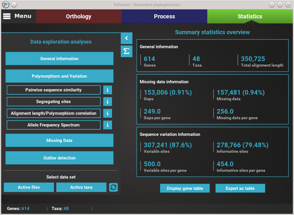
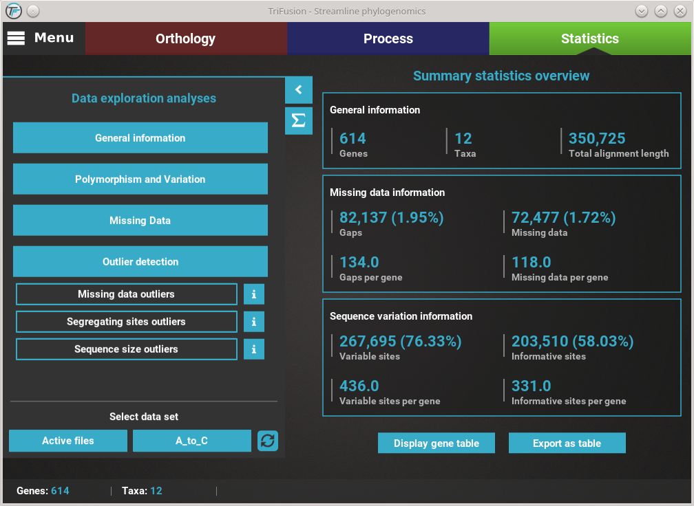
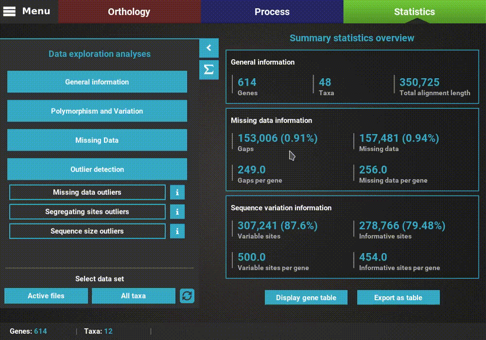
Data availability for this tutorial: the medium sized data set of 614 genes and 48 taxa that will be used can be downloaded here.
All data exploration analyses are contained within the four main category buttons that are found in Statistics’ side panel. Clicking any of these buttons will expand all available analyses under that category. For example, clicking the Polymorphism and Variation button, will show four individual analyses.
Note
This tutorial is not meant to be an exhaustive description of all plot types and analyses. For such a description please refer to TriFusion’s user guide
How to view analysis specific information
A detailed description of each analysis is provided in TriFusion’s user guide, but you can also click the information buttons (i) that are coupled with every analysis button. For instance, clicking the information button of the Pairwise sequence similarity analysis shows a pop-up with a short description of the analysis, the available plot types and what the axis represent.
Plot types
In the majority of the individual analysis, there are up to three plot types available that represent different perspectives of the same analysis:
- Single gene: You choose a single a gene from the data set and the analysis is performed on that gene (usually a sliding window plot).
- Per species: The analyses will be focused on gathering information for each taxa or discriminates it by taxa in some way.
- Average: The analyses will produce an average distribution/result across the whole data set.
For example, clicking the Pairwise sequence similarity button will ask you which plot type you wish to produce.
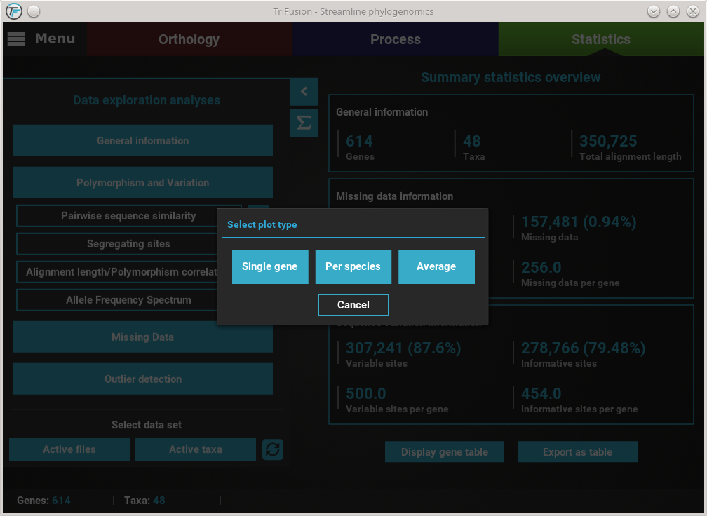
In this case, all three plot types are available. However, some options will have only two plot types available, and others only one. It will depend on the analysis.
Executing an analysis
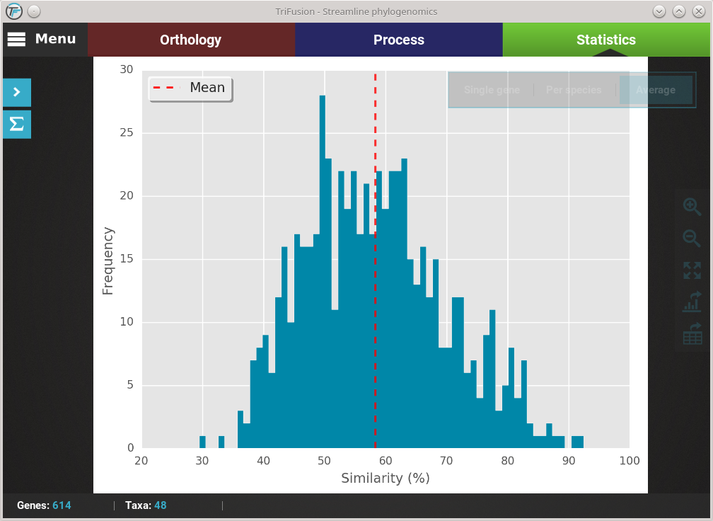
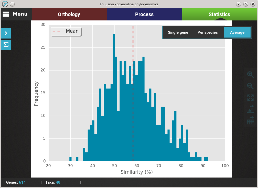
Let’s explore the distribution of sequence similarity across our entire data set. Since we are interested in an average of the data set , click on the Average button. The computation of sequence similarity and segregating sites are some of the most computationally intensive in TriFusion, so this may take some time the first time. However, TriFusion uses a hash look-up table technique which considerably speeds up future computations of these analyses in the same session. Once complete, you should see a bar plot with the distribution and mean of the pairwise sequence similarity across the data set.
Changing plot type
If you want to change the plot type of the current analysis, there is a floating box in the top right of the screen.
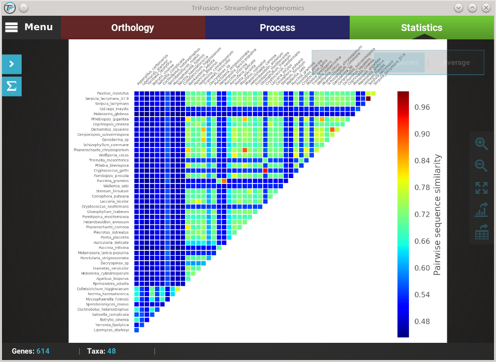
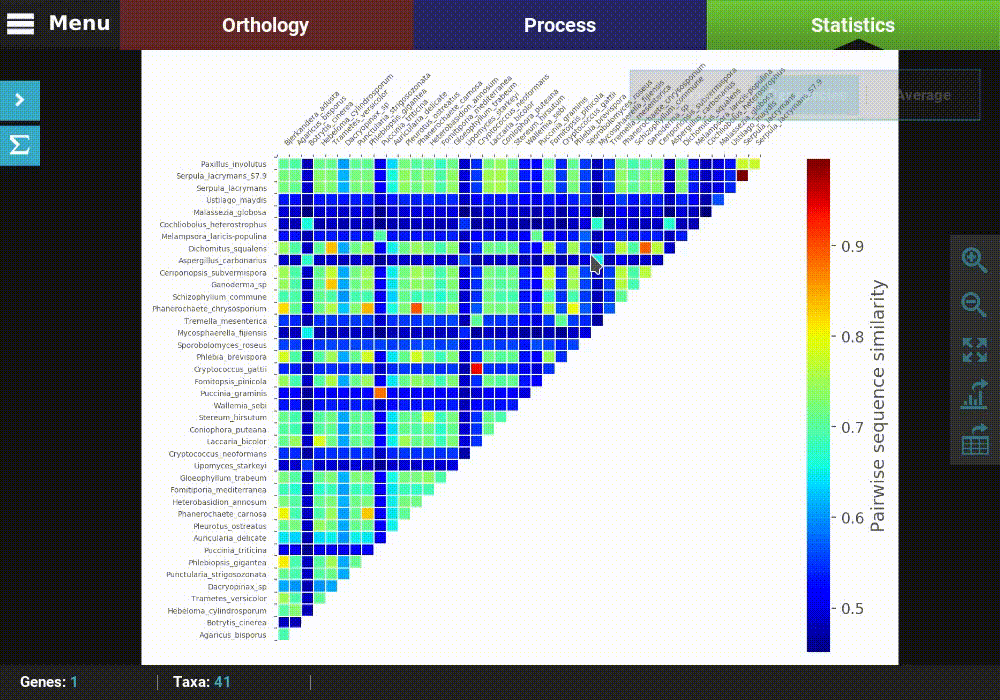
The current plot type appears with a filled blue background (Average in this case). To change to the Per species plot type, simply click the corresponding button and a new analyses should be started. At the end of the analysis, you should see a triangular heat map matrix with the sequence similarity between every species pair in the data set.
Fast plot switching
While the active data set remains the same, all generate plots are stored locally. This means that if you need to visualize an analysis that you already performed in your current session, you do not have to repeat the entire computation. For instance, we are currently visualizing the Per species plot type of the Pairwise sequence similarity analysis. If you click the Average button in the floating box to change the plot type, you’ll notice that the switch will be almost instantaneous.

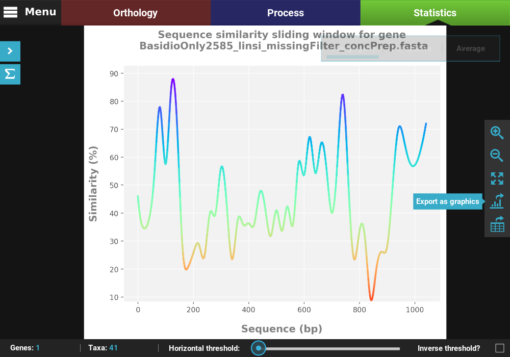
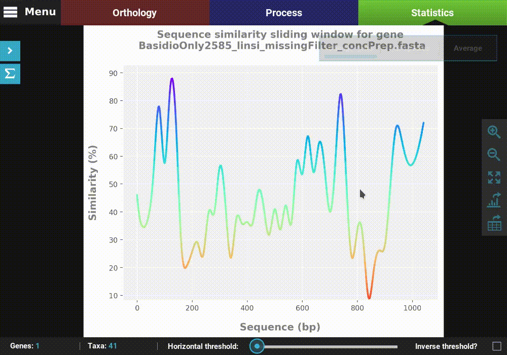
Single gene analyses
Some analyses can be performed for single genes in the form of a
sliding window analysis that contain additional features. Let’s
investigate the averaged pairwise sequence similarity for a single gene
in our data set. Click the Pairwise sequence similarity analysis and
then the Single gene plot type.
Here you can select any loaded alignment along with the size of the sliding window. The value of the sliding window may be:
- An absolute value will set the window size to exactly that value (e.g. a value of 20 will calculate the sequence similarity for every stretch of 20 alignment columns).
- A decimal value will set the window size to a proportion of the total alignment (e.g. a value of 0.1 will calculate the sequence similarity for stretches equivalent to 10% of the alignment size).
Let’s choose the first alignment in the list with a window size of 20.
Note
If the specified window size results in a very high number of sliding windows (>500), a warning will be raised where you can cancel, update the sliding window to a more sensible value or continue anyway.
If you want to calculate the sequence similarity for another single gene,
you can click on the Change gene button on the plot type floating
box.

Notice that the previously selected gene will appear under the Previous gene section and will be already selected in the alignment list. Here you can select another alignment and window size, using the search field if you like.
Export figures and tables
All plots generated in TriFusion can be exported as a graphics file and almost all can be exported in table format. These functions are available in the plot screen bar at the right of the screen.
Export a figure
Click the Export as graphics button in the plot screen right bar.
This will open a file browser where you can choose where to export the figure,
its name and graphics format.

Here we provided some name to our figure, and set the image format to svg.
Finally, click Save and the figure will be exported.
Export a table
Click the Export as table button in the plot screen right bar. As in
the previous section, this will open a file browser where you can choose
where to export the table and its name.
Then click Save to export the table. The generated table will be
in csv format, which can be readily imported by LibreOffice or
MS Excel or viewed as a plain text file.
Dealing with outliers
Outlier analyses in TriFusion are a bit different because they offer you the option to remove files and/or taxa that may have an outlier behaviour for some statistics. If you click on the Outlier Dectection category in Statistic’s sidepanel you’ll see three outlier detection analyses: by missing data, segregating sites and sequence size.
Let’s exemplify outlier handling by checking for outlier taxa for missing data, that is, taxa that contain unusual amounts of missing data. Click on the Missing data outliers button, and then the Per species plot type.
You can see that the missing data distribution is bimodal (two peaks) and that one taxa outlier was found (see the footer of the screen). In the footer of the screen are three functions to handle potential outliers:
- Remove: Clicking the Remove button will remove the outlier taxa from the current TriFusion session. This is equivalent to manually remove the taxa in TriFusion’s side panel.
- Export: Clicking the Export button will save the outlier taxa to a csv file, where each line will contain a taxon name. This can be used to change the active data set in TriFusion using a text file
- View: Clicking the View will display a list of the outlier taxa.